•Do you really want to be on somebody's newsletter, does that really matter?
Recently I saw a post about companion websites. I am sure many of you are familiar with it, it was a comparison of many different sites. Pretty neat stuff actually.
As I approach my first anniversary of coming out from UTR, I feel I want to improve the look and feel of my website. I built the site myself using iWeb, but I think I can do more and better with some fresh ideas.
So I have a few questions. What is the most important part of a companions website to you? What really grabs your attention, and makes you keep looking at the site? I recognize the photos are important, but what is it about the photos that makes you pause and think?
Do you really read the entire site? Often I find that information already posted on my website gets asked directly to me in an email. Should websites be whittled down to the bare basics rather than informative platforms of representation?
Do you feel one type of site is any more developed or professional than another? I have seen the web hosting templates and they do offer many options I just cant figure out how to code into my website.
What is the least important feature of websites you see, and the most important feature? Do you really want to be on somebody's newsletter, does that really matter?
Your the buyer, the customer, the consumer. Share with me what makes for a great site and what makes for information overload.
Finally, if ANYONE has extensive and reasonable knowledge of custom coding in iWeb, please PM me directly.

Have recent naked sexy pics, and rates clearly defined. No photoshop, or airbrushing. Be honest about age, weight, measurements.

I usually go for the pictures/ stats first, rates, review links, and calendar. The intro, friends, links, and blogs come last (links almost never)
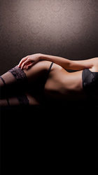
Pictures: it's the eye catcher, in my opinion different candidate poses that truly reflect you and what you have stated in your stats is the selling point to make me explore your site further and contact you. Glam pictures are nice to see, but let's not kid ourselves (I get scared looking at my mug in the mirror) most are photoshopped and touched up. I think they are a nice addition, to the ones that actually represent you. Also revealing body pictures remove the mistery that your hiding something (not x rated) but shows your body. Updated pictures at least once a year also help, it's funny when I see pictures of providers that I have seen 4-5 years ago still on their sites, it indicates that I'm in for a surprise when I walk in, unless they found the fountain of youth....
Rates: I know it's a hot topic, but it is important. Keep it simple, without funny math. Anything over the three hours should be communicated to the prospective client, no need to fill a page with it. Overnight, trips and other packages over the norm are mostly useless to many readers, reading most reviews of providers it's mostly 1-2 hours. If you provide doubles or special sessions then a highlight would be ok. Also try to have the rates on your website the same as the verification boards, or any posted specials, or some ask which rate to follow, and you guessed it, everyone wants the lowest one.
Calender and times: I know most of providers have a dual life and keeping either a local or touring calendar that is most represent the time you're comfortable hosting. I really don't think the 24/7 model applies to many.
Contact: I think the contact form is useless and many hesitate to use, I have not used it yet. Just provide the best form you are actually using wheather it's email or phone, and communicate the average responce time, it gets frustrating some time when you contact someone then it's gone into a black hole, or you get a responce so late that you already went to plan b.
Intro, and Other: in most cases it's good reading material and a window into your intellect. Some are funny, others erotic, and most promise to transport you to a world you always fantasized about and don't want to leave once your there. It's good reading but not really a deal maker ( unless you have more typos than me)
Referral: your affiliation with verification agencies like p411 etc is usefull. A link to your review will help the lazy ones who just want to click and not type.
Other website Links: Useless
Other friends:, most of the time hummm useless
Music and flash media: a royal pain especially if you are using a smart phone or a non private computer. And it does not add any to marketing.
Ok, back to Sunday's to do list 
when us ladies want to post on another website, alot of times the site requires us to put a link back to them on our site. So we are pretty much forced to put links up. Alot of times the gents don't realize we are required to post a link..
Now me...I have a links page so that I can put those links on from those "required" sites and to help the guys out. Many a time guys are looking for different sites and I will provide a link just for shits and giggles for them.
I am still updating my links page but if a guy doesn't want to look and use it, it is their prerogative.
Pictures: it's the eye catcher, in my opinion different candidate poses that truly reflect you and what you have stated in your stats is the selling point to make me explore your site further and contact you. Glam pictures are nice to see, but let's not kid ourselves (I get scared looking at my mug in the mirror) most are photoshopped and touched up. I think they are a nice addition, to the ones that actually represent you. Also revealing body pictures remove the mistery that your hiding something (not x rated) but shows your body. Updated pictures at least once a year also help, it's funny when I see pictures of providers that I have seen 4-5 years ago still on their sites, it indicates that I'm in for a surprise when I walk in, unless they found the fountain of youth....
Rates: I know it's a hot topic, but it is important. Keep it simple, without funny math. Anything over the three hours should be communicated to the prospective client, no need to fill a page with it. Overnight, trips and other packages over the norm are mostly useless to many readers, reading most reviews of providers it's mostly 1-2 hours. If you provide doubles or special sessions then a highlight would be ok. Also try to have the rates on your website the same as the verification boards, or any posted specials, or some ask which rate to follow, and you guessed it, everyone wants the lowest one.
Calender and times: I know most of providers have a dual life and keeping either a local or touring calendar that is most represent the time you're comfortable hosting. I really don't think the 24/7 model applies to many.
Contact: I think the contact form is useless and many hesitate to use, I have not used it yet. Just provide the best form you are actually using wheather it's email or phone, and communicate the average responce time, it gets frustrating some time when you contact someone then it's gone into a black hole, or you get a responce so late that you already went to plan b.
Intro, and Other: in most cases it's good reading material and a window into your intellect. Some are funny, others erotic, and most promise to transport you to a world you always fantasized about and don't want to leave once your there. It's good reading but not really a deal maker ( unless you have more typos than me)
Referral: your affiliation with verification agencies like p411 etc is usefull. A link to your review will help the lazy ones who just want to click and not type.
Other website Links: Useless
Other friends:, most of the time hummm useless
Music and flash media: a royal pain especially if you are using a smart phone or a non private computer. And it does not add any to marketing.
Ok, back to Sunday's to do list
if I don't find EVERYTHING necessary for me to make an informative decision I get frustrated and possibly move on. That probably doesn't help much but its the breast i can do. lol
As for me, I am beyond the stage where a website means that much, except to get information as to rates, and a glimpse of your personality At this point, almost all of the ladies I see are either old friends, or those I have met at M&G's that made an impression upon me in person. Since we hold M&G's almost monthly in NYC, my list of ladies to see remains full beyond capacity. But if you saw what I said at the end of my first sentence....about the glimpse of your personality, that's where the decision gets made about the next stage of consideration. Your pics are important, but hot chicks are a dime a dozen, and fake and misleading pics abound in this game It's you the person that is is the final determining factor. Far more important are the e-mails and phone calls where we introduce ourselves and both form impressions that lead to our first meeting...done right, we both have a great time, and will be looking forward to meeting again. Hope that helps!
Like the prior post said, hot chicks are dime a dozen. I'm fairly new to the hobby. Once i find a provider with looks that turn me on, the introduction has been important. Some are written intelligently and are very seductive. I assume the provider wrote it and it can be a window into her frame of mind. Some are written with an arrogant or lecturing tone. big turn off for me. A page listing gifts is tacky in my opinion.
•Do you really want to be on somebody's newsletter, does that really matter?
You have a very good website. It's impressive that you did it yourself. You certainly didn't make the common mistakes that are rampant in DIY sites.
While I haven't had a seesion with you, I get the impression that your site does a very good job of conveying your personality, and the type of experience I could expect.
You include some comments explaining the "why" of your pricing. That's risky, but your did it perfectly. It comes across as honest and legitimate without appearing self-serving or having a tone of rationalization. I thought it was positive and quite convincing.
The reason I'm not including suggestions is that there are some good comprehensive replies already, and you have a very good website right now. I'd say follow your creative and professional instincts for your next revision. I'll be looking forward to seeing it.
HalfHour
BTW, I disagree with dealbreaker about gift pages.
Pictures from various angles and ranging from fully clothed to unclothed. Tasteful. Show what you really look like. Be sure to answer the questions that shouldn't be asked in e-mail or on the phone. I look for 1.) how do you look, 2.) rates, 3.) information required, 4.) how to contact you. ( don't do the info form. e-mail is best) 5.) calendar/availability, remember keep it simple. Music, other links, etc. are unnecessary. Info about you is useful.
I agree with everything you said xyz23. Also wanted to ad that the pictures should be as recent as possible with no air brush or touch ups. also her current going rates should be there with any specials being run. the time and date they started along with the time and date they will end. in short be truthful and honest up front only because the truth will come out in the meeting.
A few well done professional photos speak volumes. For me personally, I know whether a woman falls into the "yes or no" category immediately by the pics, and well done photos make a big difference.
It is also nice to see if she has somewhat of a personality and can string together a coherent thought.
Beyond that reviews tell you that she is legit, has a good attitude, and is into the things you are into.
That's it and that's all, tick those boxes and it's a done deal.
the bold red font for titles on the page signals a little more raw than you probably want from a design point of view. i definitely get the sense of your personality and looks, without a lot of bullshit. simple and clean. clear on how we'd get together. that's a good site.
there are things i want that are hard to get. faces are important, but you won't get to see them much without a visit. the thing about competition and good design is this. you may not think you "need" expensive looking design until your competition has it. if it comes down to a last minute choice between 1 gal and another, the design may sell it.
nothing beats being a hot piece of ass that reads in some good photos, followed by having enthusiastic reviews.
It is informative, well written and the photos are professional and revealing.
A few of the photos are a bit dark. I find that a problem with a lot of photos. Lighting is one of the most important aspects of a good photo. You handle the problem of how to keep from revealing your face very well in most of the photos. You use your pose and/or your hair to obscure your face which is fine. I feel like I even know what your face looks like when in fact I don't, which is a good use of the imagination. The blurred face or the head chopped off look is a turn off.
The site and photos load right away, a big plus. It is easy to get from one photo to another. The photos could expand a little more but they are pretty good the way they are. The bigger the better, of course.
The white print on a black background is a bit hard to read. You could at least have larger print for some of us old fogies who don't see too well.
You have good price info, and identify where you are. (You'd be amazed at how many sites leave out this little tidbit of information.)
The screening information is very specific which is good. Some might get turned off by rigamarole but if this level of screening works for you, then I'm fine with it. Your safety has to be your number one priority.
One thing I would change is the dark background. I know that it makes it a lot easier to make the site but using lighter colors gives a less somber and more festive look to a site. Pastel colors seem to work best.
I took some time and looked over your site and I was immediately impressed by the professional presentation. Your text was well written and your grammar and spelling were excellent. The following are my opinions, so please don't take offense. For me it is all about the photos. Remember, guys are visual and nothing excites a male more that sensual (sexy) photos. First impressions are important and the main page photo should be a "grabber". Your photo (on the cover page) while attractive and artistic could be changed to a more sensual photo. Instead of jeans, why not have a photo which accentuates your beauty and shows a little more skin; possibly a photo of you in a thong or sexy lingerie. I know I would like to see a little more backside in your photos (I'm an ass man). I understand your concern about preserving your privacy, but I would like to see a little more of your face. Maybe you could reveal a little more and still retain privacy. I am sure that a professional photographer would be able to help in this area. Finally, I like to see links to reviews on a provider's site because sometimes I may visit a website from a link other than TER. I hope this helps and my remember that my comments were intended to be of assistance. Good luck.
To improve it, I'd double the amount of pictures to show you in a greater variety of outfits and poses. When I visit a site it is always the pictures I go to first. Like most guys, I am highly visual. If your "look" turns me on, then I'll "look" further, stopping next at the rates. If you look good and I can afford seeing you, I may look further in the site at sections like "about me," "etiquette" and "booking." Then I'll go to your reviews, so a link is nice.
PS: I saw some newer pix on your site and liked them. You have a combination of sexy and classy that I like.
Everyone knows too much embellishment about you is fake. Provide realistic, human information, you are not an angel, aphoridite, goddess, etc., if you are you won't be here and I for one will be afraid to call angels, they don't exist.
As the previous poster said, all that stuff is turn off. Post pictures naked eyes can see, 44¢ stam expanding to 88¢ stamp is not good. Rates are very importnat, I for one will not ever call you and ask "how much" via telephone or email.
If you have rule and everyone has them, post it in language that is not offensive, talking down or like you are talking to a bunch of street urchins. It will most probably drive away the type of client you may want to have, if not go right ahead.
Just my 02¢.
I am in-between family errands but wanted to drop a line to EVERYONE.
The information I have gotten so far has been great and I really appreciate people taking the time out to answer it. Gotta run, take care and Thank You again.
I aint the writer of this tripe: http://en.wikipedia.org/wiki/File:Zodiac_cipher.png
::grim, sarcastic smile::
But still.. the zodiac sign stuff is kind of a turn-on cuz thats what regular girls bring up (esp younger ones) when you date them. Adds a bit more of a sense of realism to the encounter, vs just fucking a fleshlight attached to a blow-up doll..
Plus stating one's likes tells you a lot about what kind of person the girl is.. and adds some degree of trust to the affair (as she seems less like the kind of girl who's just thinking of you as a sucker as opposed to a client, if she's telling you all those personal bits about herself & can stay consistent about it)
Like the chicas, though, every guy's preferences differ...
one word - mac mac mac - ok that's 3. so tired of Provider sites that are not Apple compatible
Many hobbyists have wives or SO's, and, to click on a web site and be greeted with music--no matter how great it might be--puts them in danger at home. No need for that.
As others have said, good photos from interesting angles (and within the last year), rates, and some things that show your personality, are great. I agree that "gift lists" are tacky.
If they start joking about moving in together, marriage, having kids should I just take it as that, a joke or should I start running?