Since I needed a couple days of antisocial downtime after returning to the US, I decided to be productive and make some overdue modifications to my website. Mostly these are in the areas of menu/title design as well as text coloring for aesthetics and readability, but there's a few other added goodies as well.
If you've seen my site previously, and recall what it looked like, I'd really love your feedback on the modifications. Replies, PMs and email all work. Many Thanks!
It's supposed to be your "welcome" page. Comes off as demeaning. "Enter" "Exit" buttons always work. I don't know, it may be my monitor for I haven't calibrated pantones for almost 2 years, but your selection button fonts seem dark at the top of the the letter and the gradient is brighter toward the bottom. It looks like the letters are truncated, though they are not. Like I said, it my be my graphics card and monitor, but I thought I would mention it. Otherwise, the site is good to go.
It looks good. Great new pictures. Also got rid of link to blog that had not been updated in a long time.
Posted By: EveAlexander
Since I needed a couple days of antisocial downtime after returning to the US, I decided to be productive and make some overdue modifications to my website. Mostly these are in the areas of menu/title design as well as text coloring for aesthetics and readability, but there's a few other added goodies as well.
If you've seen my site previously, and recall what it looked like, I'd really love your feedback on the modifications. Replies, PMs and email all work. Many Thanks!
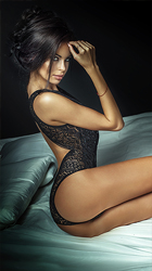
and I saw no enter/exit type buttons that were already mentioned. Your new pictures are fun (with the fruit--hmm, interesting idea). You still look great. Good luck with the new site.
Posted By: EveAlexander
Since I needed a couple days of antisocial downtime after returning to the US, I decided to be productive and make some overdue modifications to my website. Mostly these are in the areas of menu/title design as well as text coloring for aesthetics and readability, but there's a few other added goodies as well.
If you've seen my site previously, and recall what it looked like, I'd really love your feedback on the modifications. Replies, PMs and email all work. Many Thanks!
You did a nice job overall, but as a hobbyist, I would prefer not to look at pictures of someone under my consideration that are look-a-likes, no matter if there is no intent to deceive. Part of what I do for a living is to review photographic matter. There's at least 3 to 4 pictures in your gallery that appear not to be you, frankly. Your statue, legs, ass, and differential - waist to heels are completely different in some of them. If they were all taken in the last six months, I suspect thety are of different women or at least that is the vibe I get. Perhaps, at least two different women, who are similar to you in build and gross measurements, hair, etc. While, I know that you have a good reputation and there is likely no intent on your part to deceive, this is more intellectual dishonesty. Of all people, I suspect that you can at some level, appreciate what I am saying. Saving for some hero worshippers that will come to your rescue, I am standing by first amendment right to have an opinion. I am also allowing for that I could be completely wrong.
I might also suggest that your basic rate for "friends" and first timers (less that five dates) is the same. What does that say about your "friends?"
I know Eve personally. Those pics ARE real and to discredit her photographs when you have no idea what you're talking about (and I know that because I know they are real) places you in a category of gentleman which I think you might not want to be in. I'll save the naming for you to do. Feel free to be creative.
All of those photos look exactly like her and there is no deception. How do I know this? Well, I've obviously had the luxury of seeing Eve (all of her) on many, many occasions for both business and pleasure. And I can tell you, if I was considering her based on those photographs, I would not be disappointed when she opened the door.
Consider yourself "completely wrong", among other things.
More like a thinly veiled attack on the accuracy of her photos which is not constructive at all. He picked the wrong provider to accuse of using fake pics. So much for his "professional" opinion.
Anyone who's paid a modicum of attention to the Chicago board over the last few years must have noticed Radcow has some hard on about Eve, for whatever reason. The photos are obviously Eve. He should just move on.
Beautiful site with very wonderful pictures. Great taste! "Entering Eve" is my favorite part (pun is intended).
- "Intuitively challenged" is bit hard words. For most provider site, I intuitively expect "Over 18-Enter" button. Site doesn't format well on mobile - Current travel thoughts is dated. April 16 is already past. - On my laptop the top of gradient gold lettering used on left hand menu is blend into black background and it makes difficult to read. - Maybe you can remove your email from Entering Eve page and replace with a button or a contact form. Putting email id on the site is open to bots who can scrape you email and sending you spam emails.
I could look at any of her web site pictures out of context and know immediately they were true pictures of Eve. Eve, I love your web site. I agree with the one comment that the edges of the menu options are blurry. The new pictures are awesome.
First, I'm no photo expert, but I have met Eve. I really think that she is better looking than the photos, although they do appear to be of her. The new pictures are nice, particularly the one with the fruit. I also like the number and broad variety of the photos.
Second, I do like "enter" buttons. I think the absence of one will cause some to go elsewhere.
Third, the new site does not "fit" well on my iPad. The screen is too full; it needs something akin to a margin. I do not know enough about computers to know the cause.
I think the whole color scheme is a bit too dark, but that's a completely subjective view.
You should ask gentlemen for new reviews ( one or two) on your site or consider dropping the "word of man" section
Unfortunately it looks like your attempt to purchase VIP membership has failed due to your card being declined. Good news is that we have several other payment options that you could try.
VIP MEMBER
, you are now a VIP member!
We thank you for your purchase!
VIP MEMBER
, Thank you for becoming VIP member!
Membership should be activated shortly. You'll receive notification!